Practice Dashboard: Revenue Per Client Loyalty Program Graph
Revenue Per Client Loyalty Program Graph
As your clients begin to participate in your loyalty program, you will be able to use the below graph to evaluate their spending behavior.
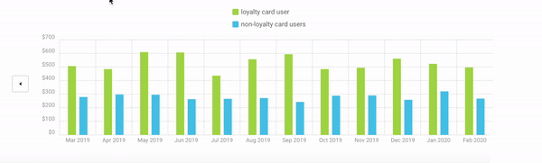
Graph definitions
- X- axis — Trailing 24 months
- Y- axis — Average revenue per client during that month (this is calculated by dividing the total amount of revenue collected in the month by the total number of clients with a transaction that same month)
- Green bar (cohort) — Clients participating in the loyalty program
- Blue bar (cohort) — Clients not participating in the loyalty program (essentially, this is your control group)
- Arrow on the left — Scroll to the previous 12 months to allow a comparison of month-over-same-month
- Arrow on the right — Scroll to the most recent 12 months
- Hover over green bar — Total revenue collected during that month from clients participating in your loyalty program
- Hover over blue bar — Total revenue collected during that month from clients not participating in your loyalty program
How the graph works
When the Vet2Pet platform is installed in your practice, all clients and transactions are extracted from the prior 24 months. If clients are not participating in your loyalty program, they are assigned to the blue cohort (non-loyalty card users).
Once a client engages in the loyalty program by collecting two or more stamps, they are transferred from the blue cohort to the green cohort (loyalty card user). Since we import past and present spending, this graph will show the influence of the loyalty program by measuring the revenue per client per month.
When clients have their first interaction with the loyalty program, all of their past spending is represented in the green bars of the prior months. This allows for an apples-to-apples comparison to view the impact of the loyalty program on spending behavior. The typical response is to see an uptick in the green bar after you start your loyalty program.