Understanding Your Loyalty Program Revenue
Understanding your loyalty program is critical to managing the impact on client spending in your practice. The Revenue Per Client graph represents this data in an "at-a-glance" format.
Revenue Per Client graph
This graph lives at the bottom of the main page of your practice dashboard. It is the first graph that will begin to change as you implement your loyalty program.
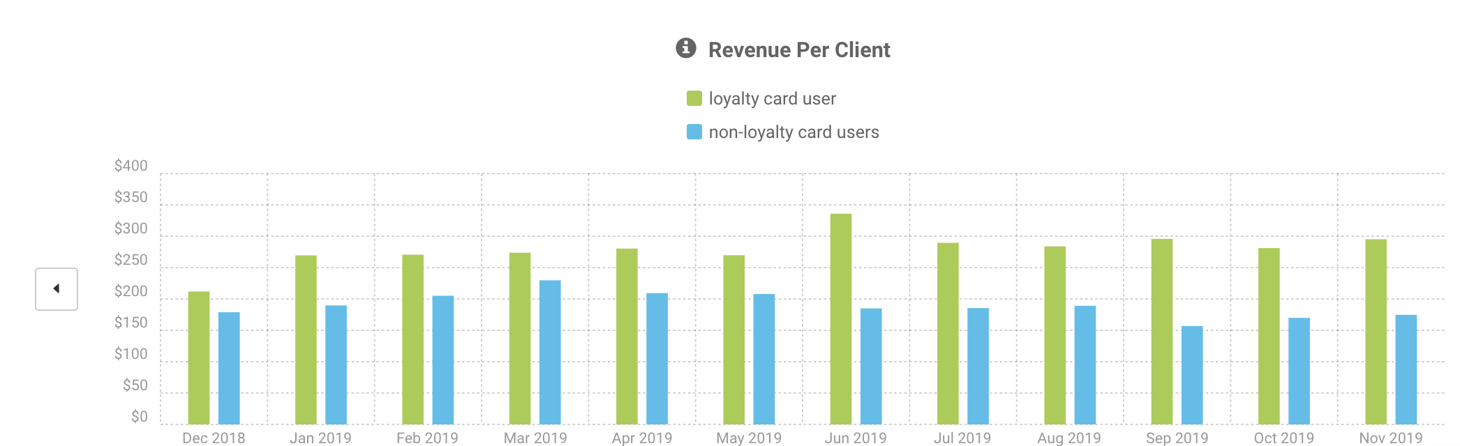
Click here for a basic overview of the graph.
Interpreting the graph
As your clients begin to use your loyalty program, the green bar will start to change to represent those clients. You will see an increase in the revenue spent per month with the green cohort (Y-axis). Find the date you started your loyalty program, and then view how much the green bar lifts. This represents additional spending from your loyalty clients.
In the example graph above, the practice's program started in June 2019. We have two ways to view this:
- 6-month pre-loyalty vs. 6-month post-loyalty impact
To determine the total revenue gained in 6 months, hover over each green bar to view the monthly revenue, then sum those up for the total period. That will be the total revenue from loyalty members in each period.
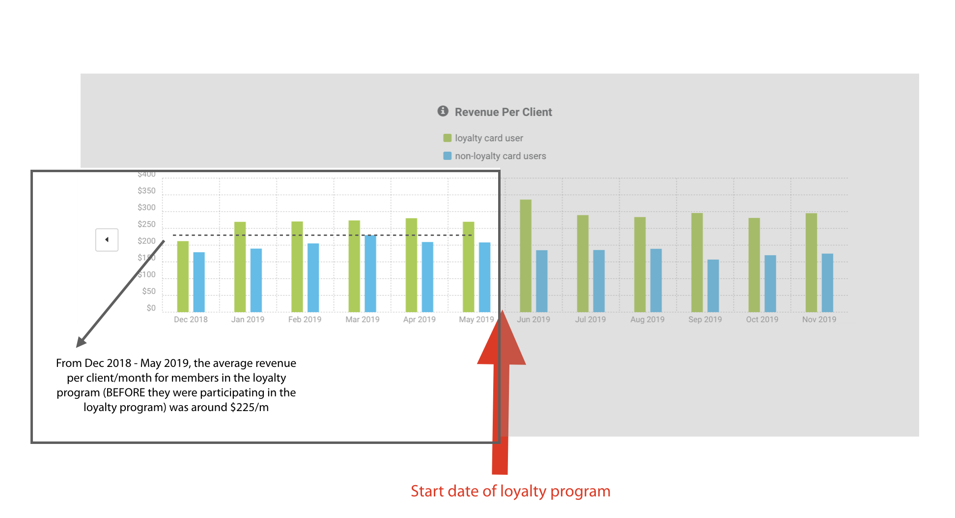
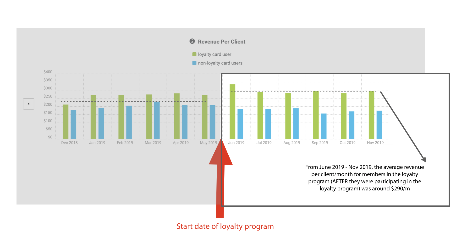
When we compare the 6-month average monthly spending by clients participating in the loyalty program, we can see the average went from $225/client in the pre-loyalty period to $290/client in the post-loyalty period. This means that clients participating in the loyalty program are spending around $65 more per month.
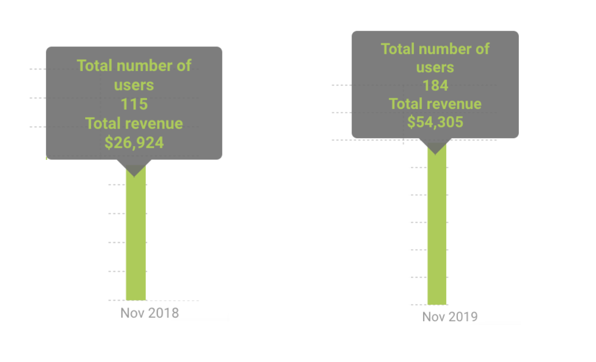
- Monthly year-over-year loyalty impact
Since veterinary medicine is a seasonal industry, it's a good idea to look at monthly revenue year-over-year to evaluate the impact of your loyalty program. In this example, we will review November 2019 vs November 2018. This practice started their loyalty program in June 2019. Using the Revenue Per Client graph, hover over the green bar during the month of interest to view the total number of clients and revenue during that month.
- In November 2018, of all the members in their loyalty program, 115 visited that month and spent $26,924, resulting in an average of $234/client.
- In November 2019, of all the members in their loyalty program, 184 visited that month and spent $54,305, resulting in an average of $295/client.
What we don't know:
- It's likely that some of the clients who visited in November 2018 are different than the clients who visited in November 2019. And, some of the clients who visited in November 2018 are the same clients who visited in November 2019.
- Did this practice have some sort of marketing effort or new service added in November 2019 that could have resulted in their best clients spending more and visiting more?
What we do know:
- This practice's best clients spent more at the practice during November 2019 than the practice's best clients spent during November 2018. We will have to continue to compare monthly year-over-year and wait for the 12-month mark to understand the full impact of the loyalty program for this practice.